How do you get more impact with text for a powerful painting?
Now what? You’ve developed skills at watercolor, but how do you get your message across with text?

Shapes and colors come easily with excellent reference materials to paint from. The perfect photo you took on vacation, or catching winter light dancing through the icicles. What if you want to say something specific. Perhaps something you can only communicate with words? You have a point to emphasize, a revelation from the Holy Spirit, or a personal experience to share.
I’m still struggling with these ideas and don’t have a formula. Some artists continue to have great ideas. They consistently come up with beautiful ways to illustrate their paintings with lettering.
Where does that leave us novices? I tried some text placement on the above Luna Moth in my watercolor journal. So I wouldn’t “ruin” the photo, I made color copies and proceeded to write on them. I tried 3 different methods.
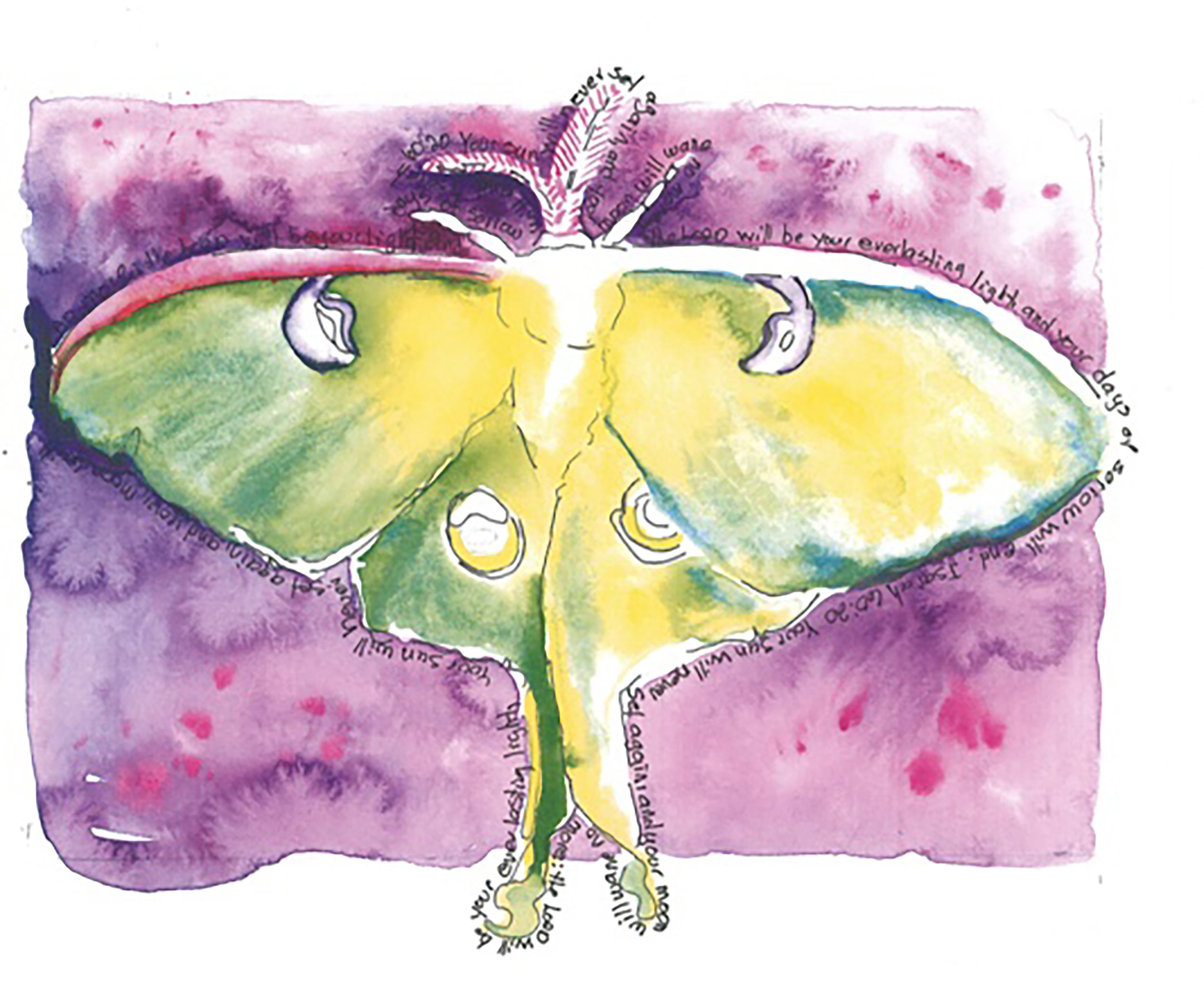
Method One: Marching Ants

Method 1
Can you see the words almost moving around the wings? They are outlining the moth painting. The advantages are the flow of words is fun. One disadvantage is you have to read upside down at the bottom.
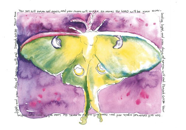
Method 2: Bordering with Text

Method 2
Simply writing around the border gives this illustration a framed feel. I really like this look. Once again, you have to read upside down at the bottom.
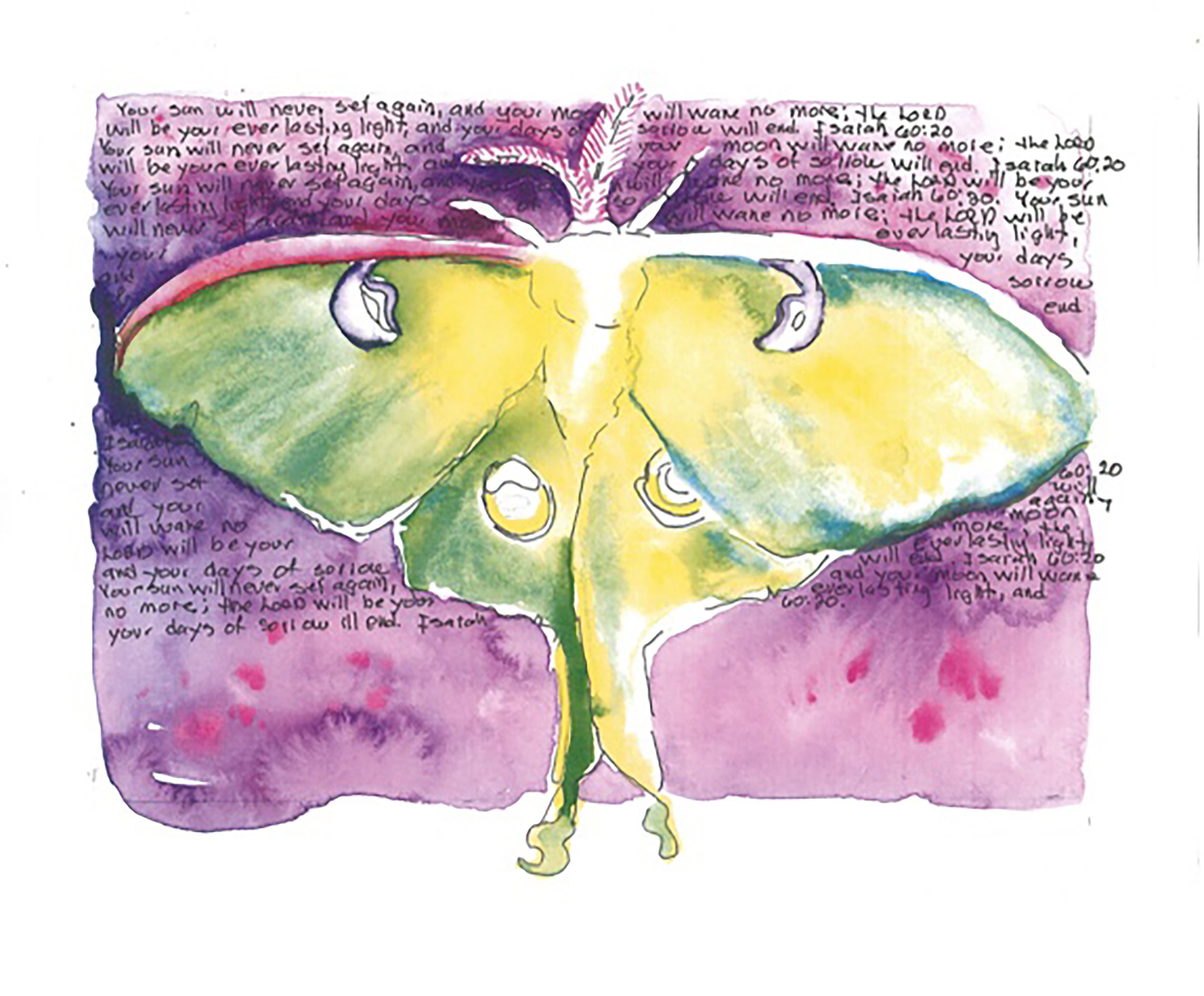
Method 3: Filling the Background with Words

Method 3
With background text, you don’t have to read upside down. It’s relaxing. If I start reading and my eyes get tired, the text fades then becomes an element of texture in the background. It’s pleasing and restful. After I explore the moth picture, I can go back to reading the text if I want to.
How should I finish this sketchbook journal entry: Which of the above examples do you like the best? What works for you?